Context
Commissioners had data, but no map
“I’m in a sea of data and I don’t have a map.”
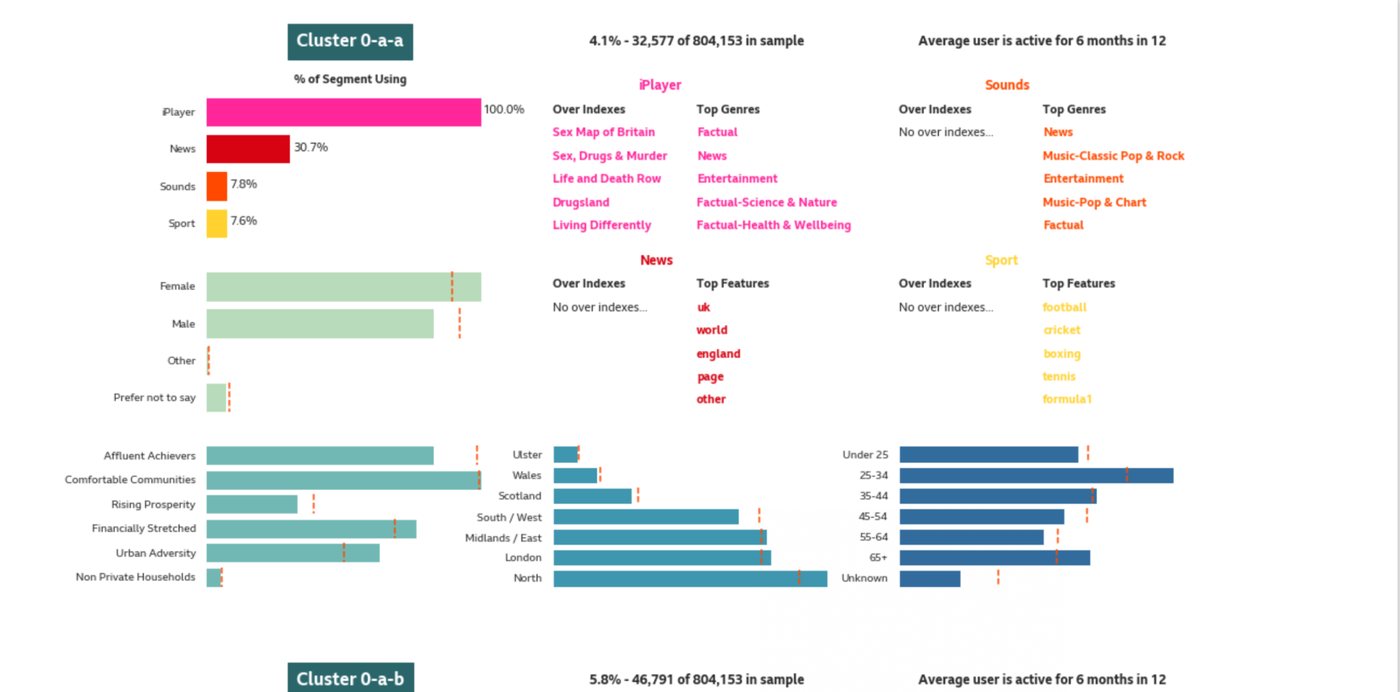
Audience, content and production information existed across different tools and teams. Commissioners could see fragments, but not the complete picture.
This made practical questions difficult to answer: which topics interested younger audiences, where the BBC was underserved by age or region, whether content was being duplicated, and whether an audience need required a new commission or could be met through existing content.
The value was not more data. It was greater confidence in the next editorial decision.
A promising prototype lacked a clear workflow
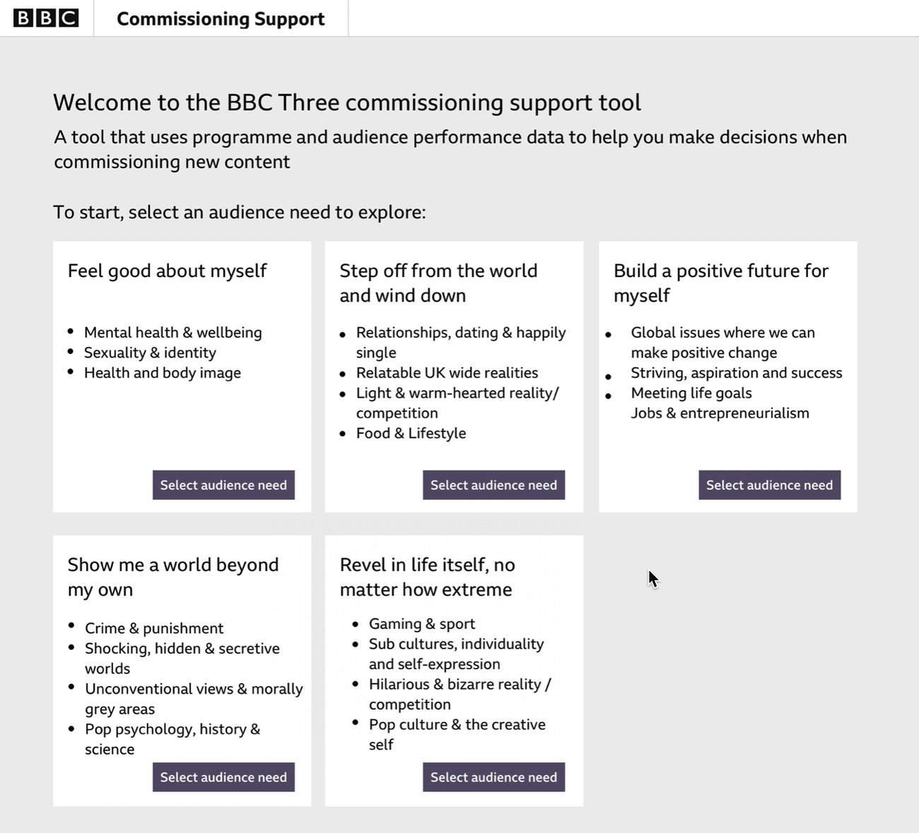
Before I joined, the team had built a prototype for the Controller of BBC Three. It used performance data from existing programmes to highlight opportunities for new content.
Testing produced mixed feedback. People understood the idea, but were unclear who the product was for or how it would help them day to day.
I was brought in to lead a UX team of three and help turn the concept into a production MVP that could serve more than one commissioning team.
Approach
From showing data to supporting decisions
Pre-planning widened the product’s purpose
My first move was to shift the brief from “show me data” to “help me decide what to commission, reuse or prioritise.”
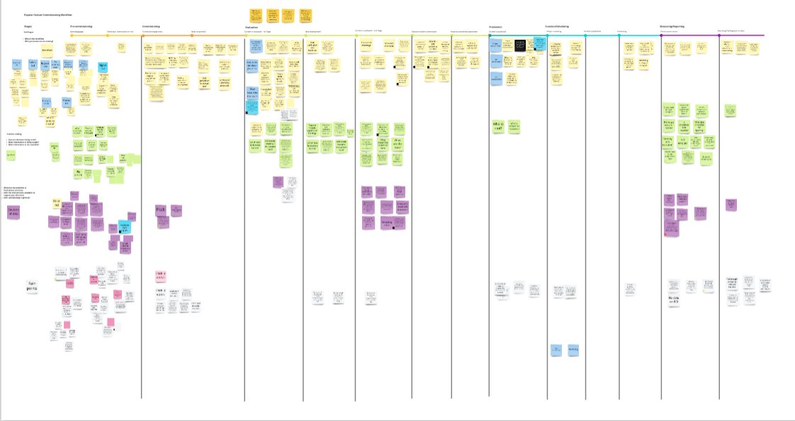
Research revealed a missing stage before commissioning: pre-planning. Teams often needed to understand whether an audience need could be met by curating, resurfacing or scheduling existing content before creating something new.
This made the product relevant beyond BBC Three. It could also support iPlayer teams building curations and schedulers looking for archive content to rebroadcast.
The tool was no longer only about finding opportunities for new commissions. It supported the earlier decision about whether a new commission was needed at all.
Research revealed what to simplify
Earlier discovery had identified broad pain points, but not what information people needed at each stage of their workflow. I made the case for further research before the team committed to the MVP structure.
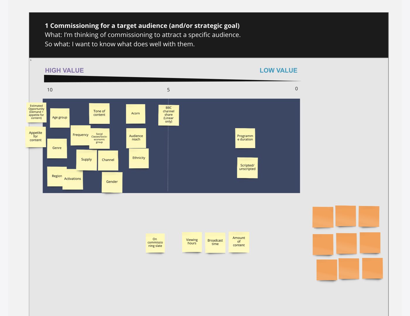
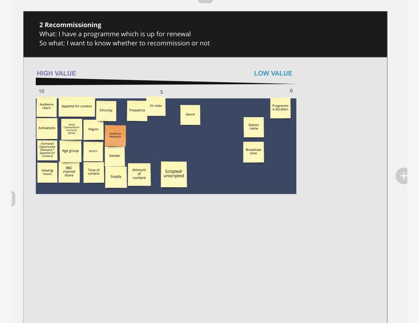
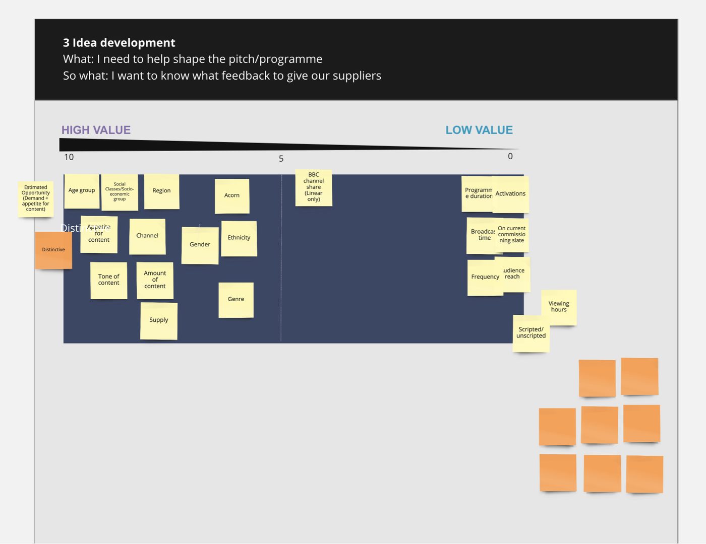
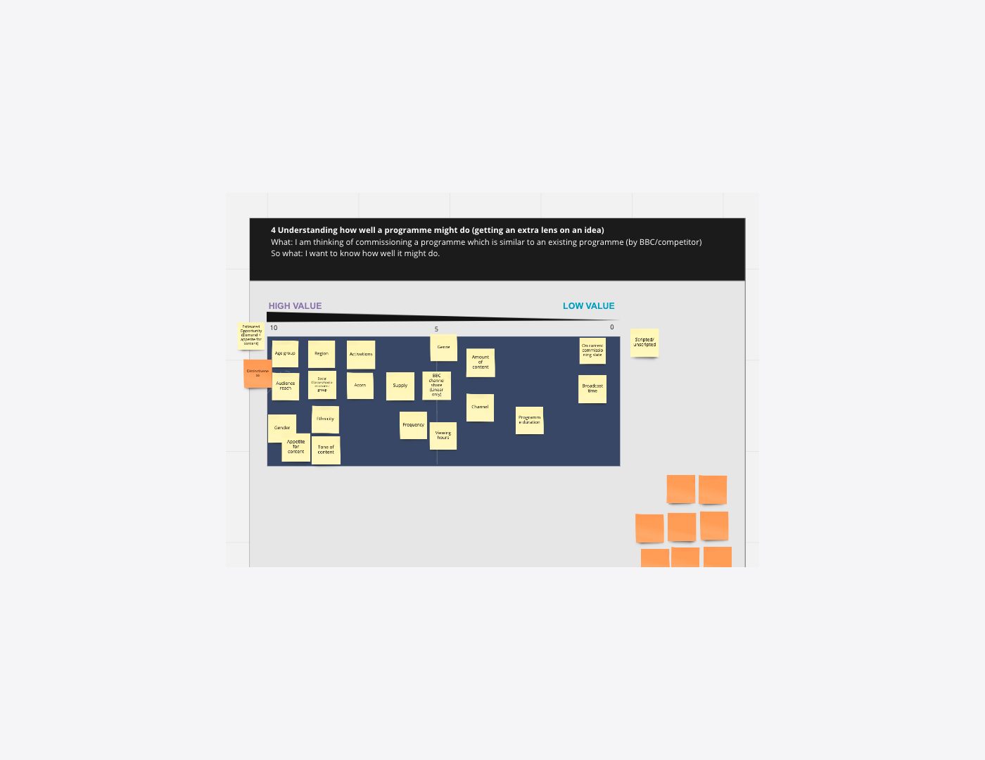
To move quickly, I led paired card-sorting sessions with 12 content creators from different parts of the BBC. Pairing participants helped us cover more workflows and exposed where needs overlapped across commissioning, scheduling and editorial planning.
The research changed four parts of the product:
- Journey simplified so users could reach decision-relevant information faster.
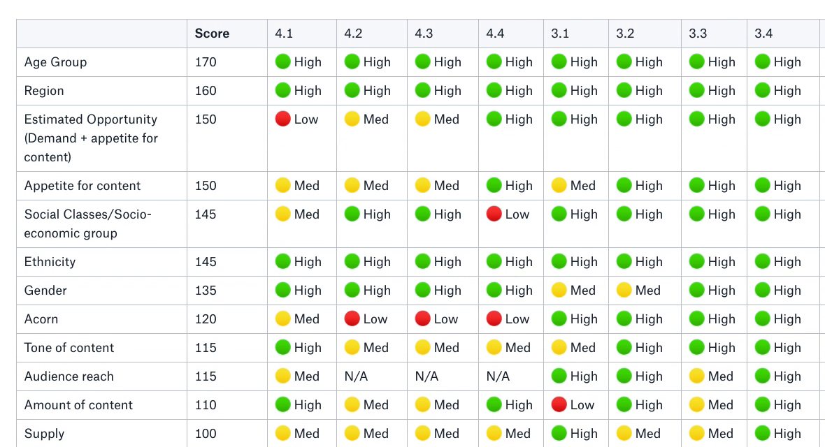
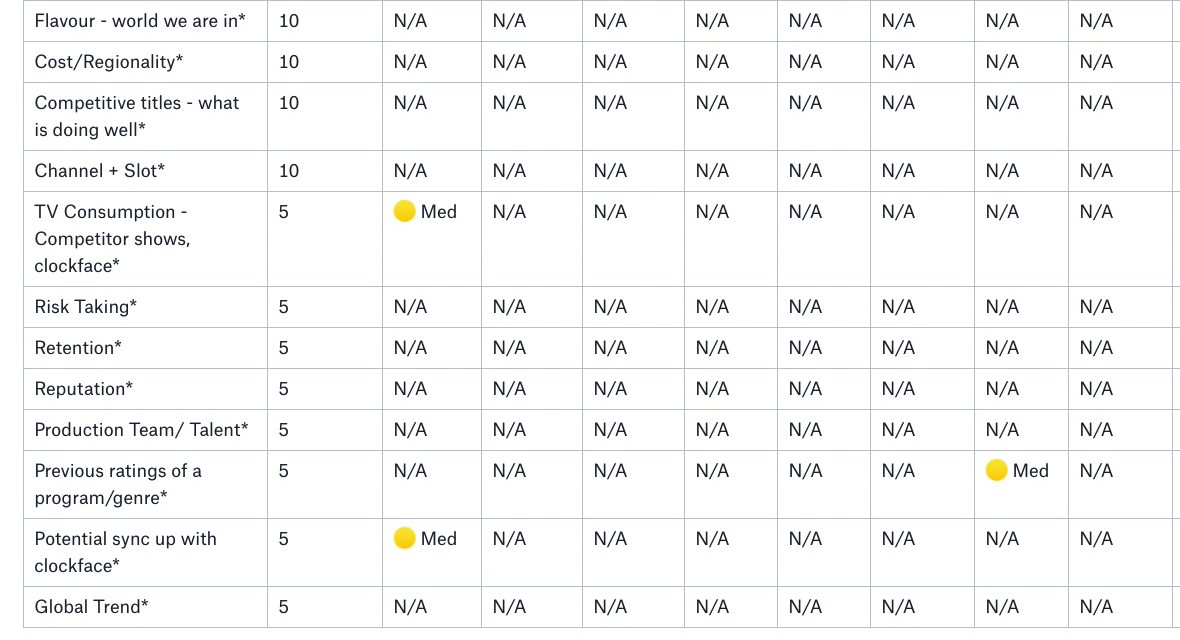
- Filters prioritised age and region because they appeared consistently across sessions.
- Groupings broadened to match editorial planning language.
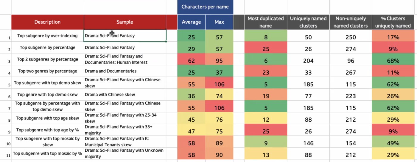
- Naming improved so users could understand what each content cluster represented.
The design work was deciding what to simplify, what to expose and what the system needed to explain.
Better data made the information architecture harder
The prototype relied on BARB data from linear broadcasts, manually mapped to content groups. For the MVP, we added daily iPlayer data from signed-in users to better represent younger audience behaviour.
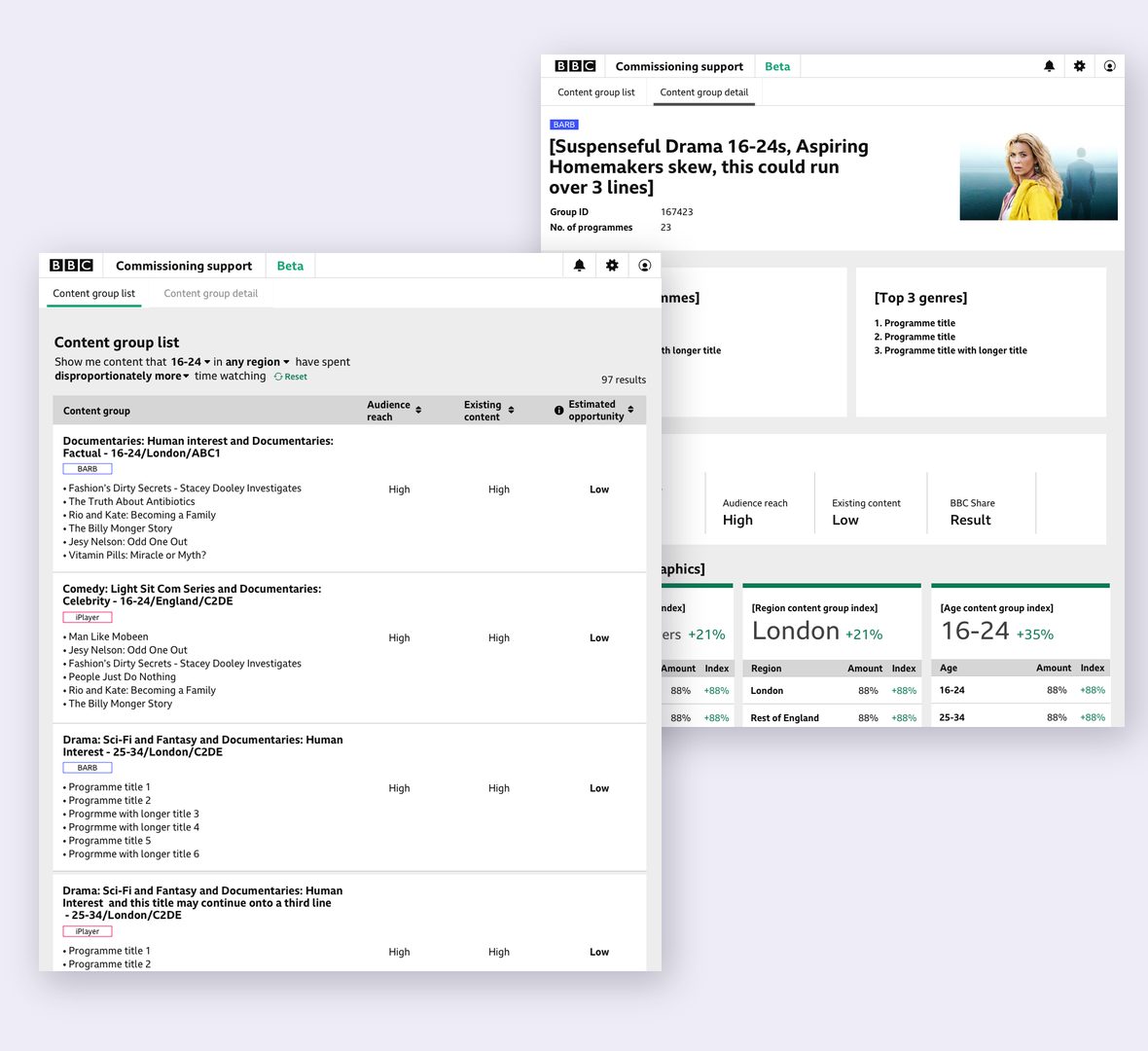
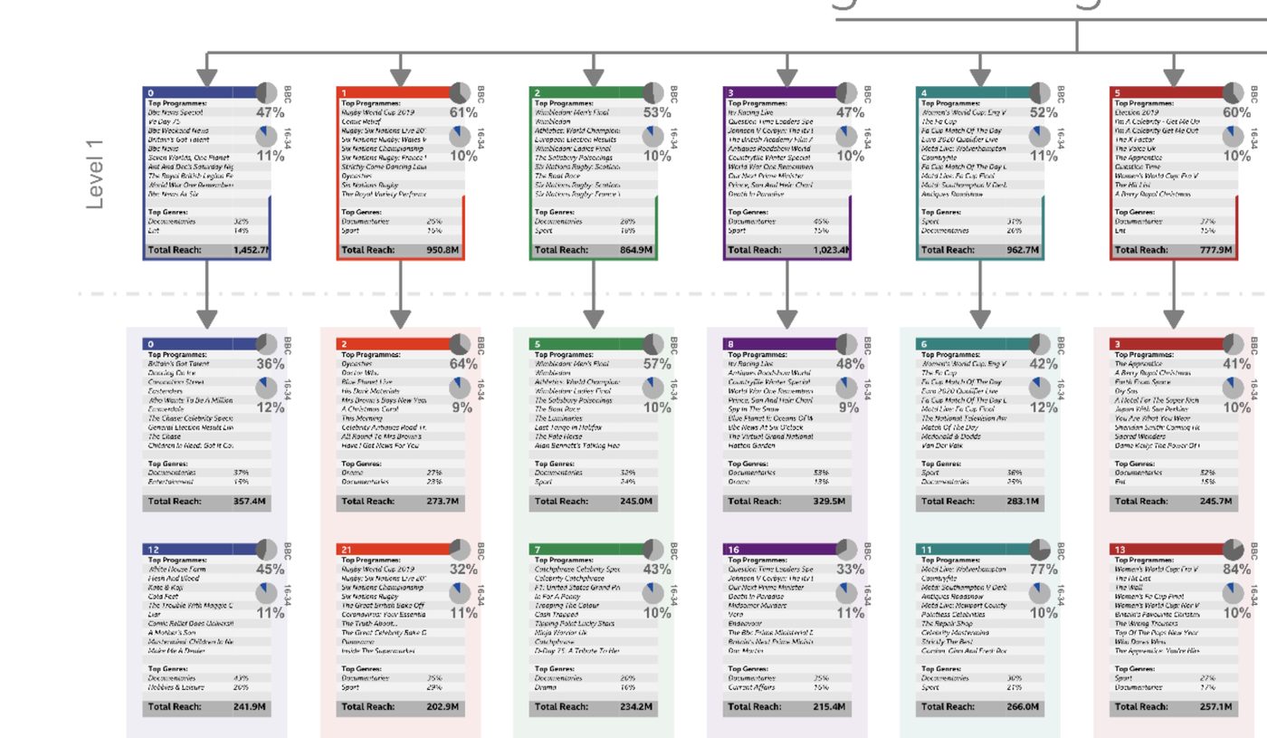
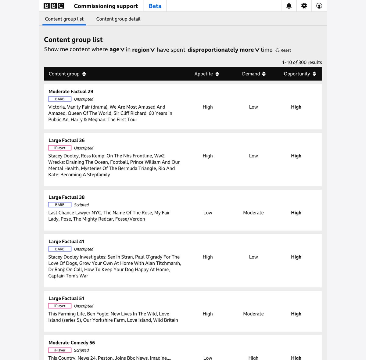
This made the product more useful, but also made its information architecture more complex. The system generated more than 300 content groups that changed each day.
I worked with Information Architecture and Data Science to introduce sub-genres and demographic information into the naming logic. This produced unique, meaningful names for 95% of the clusters.
The interface and data model could not be designed separately. If the groups were unclear, the product would remain difficult to use regardless of how the screens were organised.
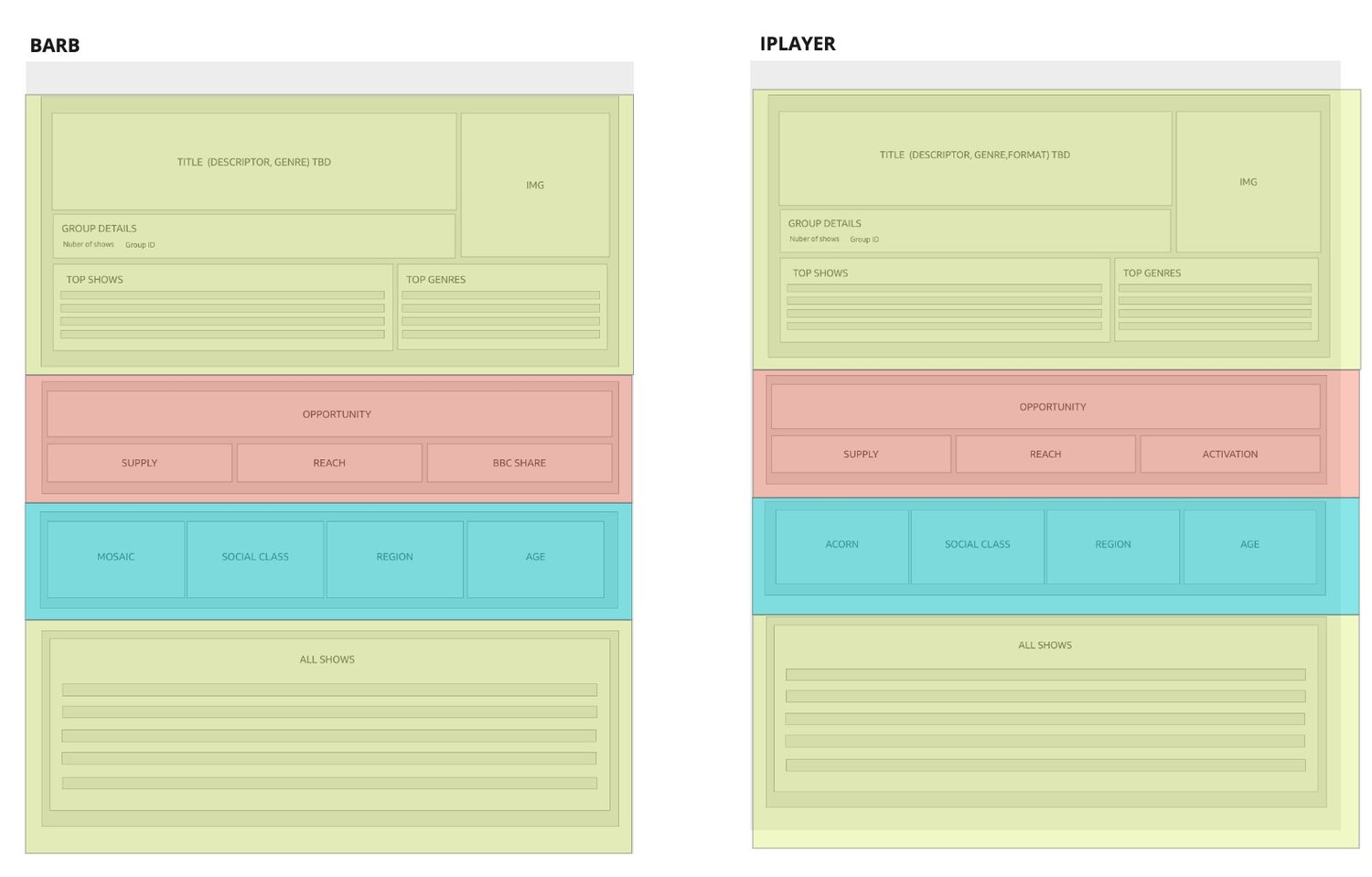

We organised the tool around commissioning questions
I used a “Now, Next, Later” structure to move the experience away from raw data exploration:
- Now — what do current audience and content patterns show?
- Next — where is there a gap or opportunity?
- Later — what might require commissioning, curation or scheduling attention?
The MVP allowed users to explore patterns by age and region, understand content groups in editorial language, and compare audience opportunities with existing programmes.
I worked with Product to broaden the use case, with Data Science and Engineering to understand what could update dynamically, and with Information Architecture to make the results meaningful to non-technical users.
My role was to keep those decisions anchored to the editorial workflow rather than the structure of the underlying data.
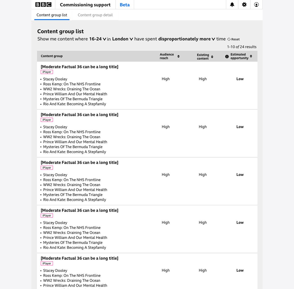
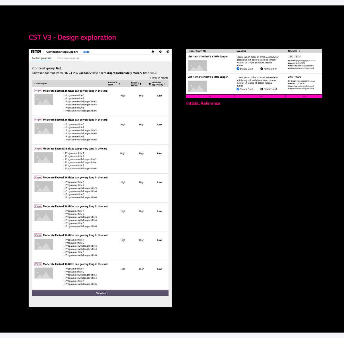
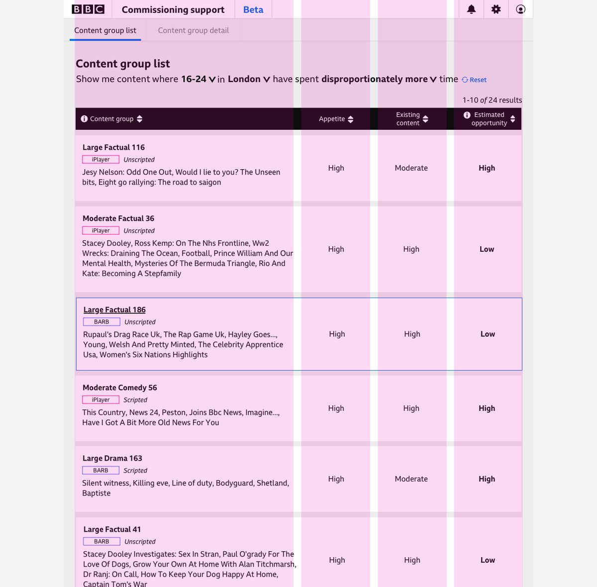
The names had to survive the layout
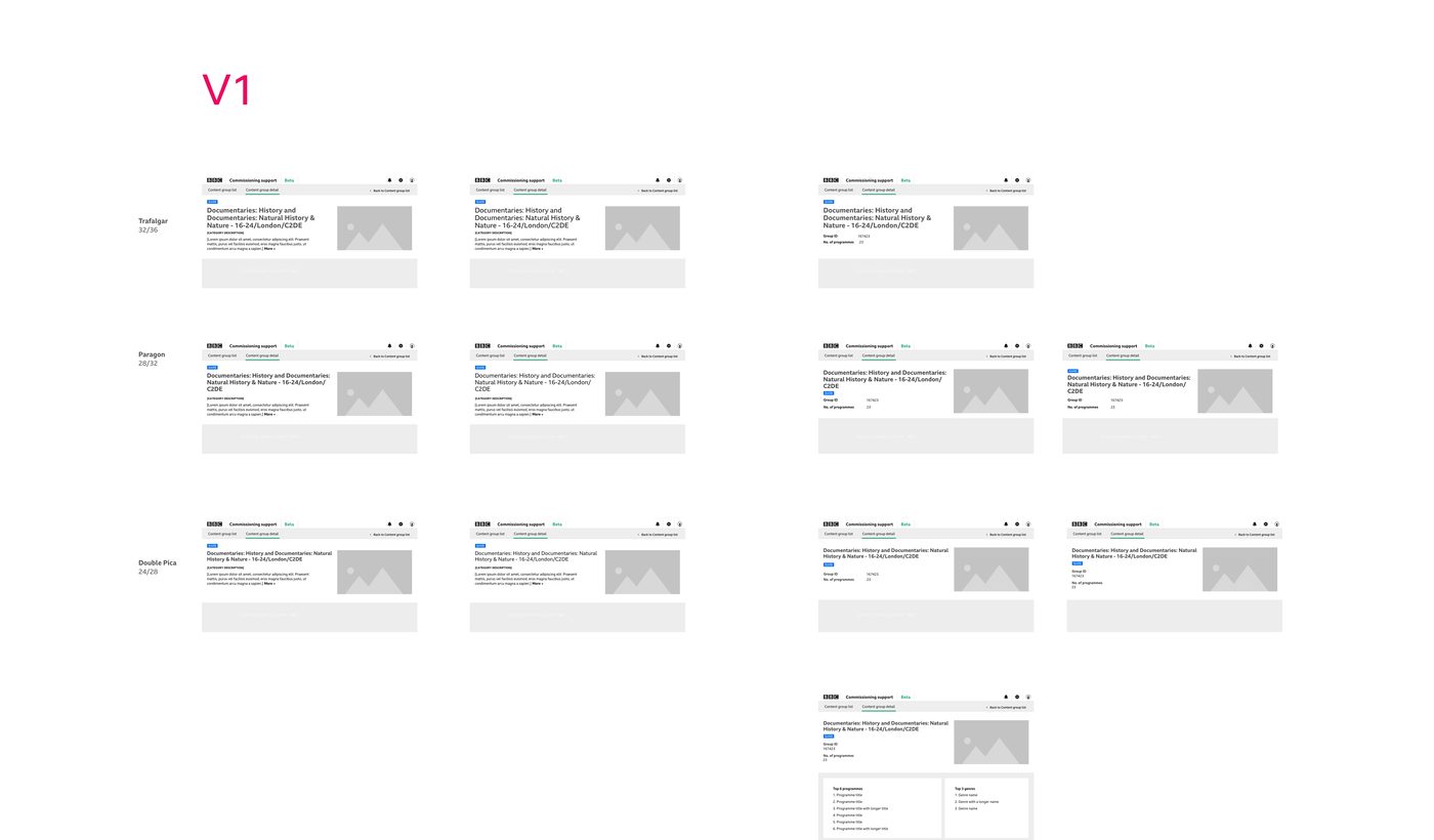
Naming the clusters well made them longer. A single group could run to three lines, and it still had to sit in a table row next to three metrics without pushing them out of reach.
I tested the group heading at three sizes from the BBC’s type scale against the longest names the system could generate, rather than against sample text that happened to fit.
Results
From a mixed prototype to a production MVP
The Commissioning Support Tool moved into production with a broader BBC-wide purpose than the original BBC Three prototype.
300+
Content groupsRebuilt daily from BARB and signed-in iPlayer data
95%
Uniquely named clustersUp from generated labels people could not tell apart
12
Content creatorsPaired card sorting across commissioning, scheduling and editorial planning
3
Teams servedCommissioning, curation and scheduling, from a BBC Three-only prototype
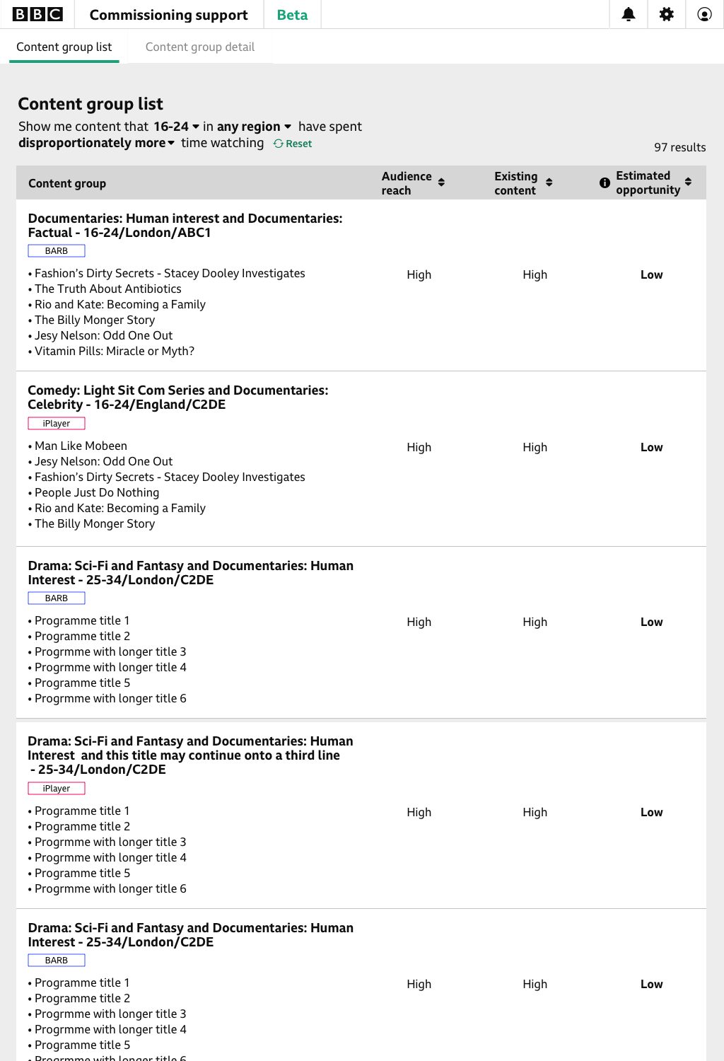
The work did not have a public adoption metric, so the strongest evidenced outcome is the product and organisational change: a mixed-feedback prototype became a production MVP with clearer foundations for wider BBC use.
Reflection
Looking back, the hardest part was not the data, but agreeing what the product was for. Widening the brief from one BBC Three prototype to a tool for commissioning, curation and scheduling meant the interface and the data model had to be redesigned together, not handed from one team to the next. That reframing is what let a mixed-feedback prototype become something the rest of the BBC could actually use.