Context
A supplier change became an opportunity to rethink the service
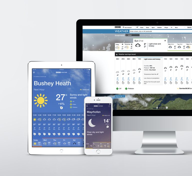
A new weather-data supplier gave the BBC access to more detailed forecasts. The challenge was to make that information useful while preserving the familiarity audiences expected.
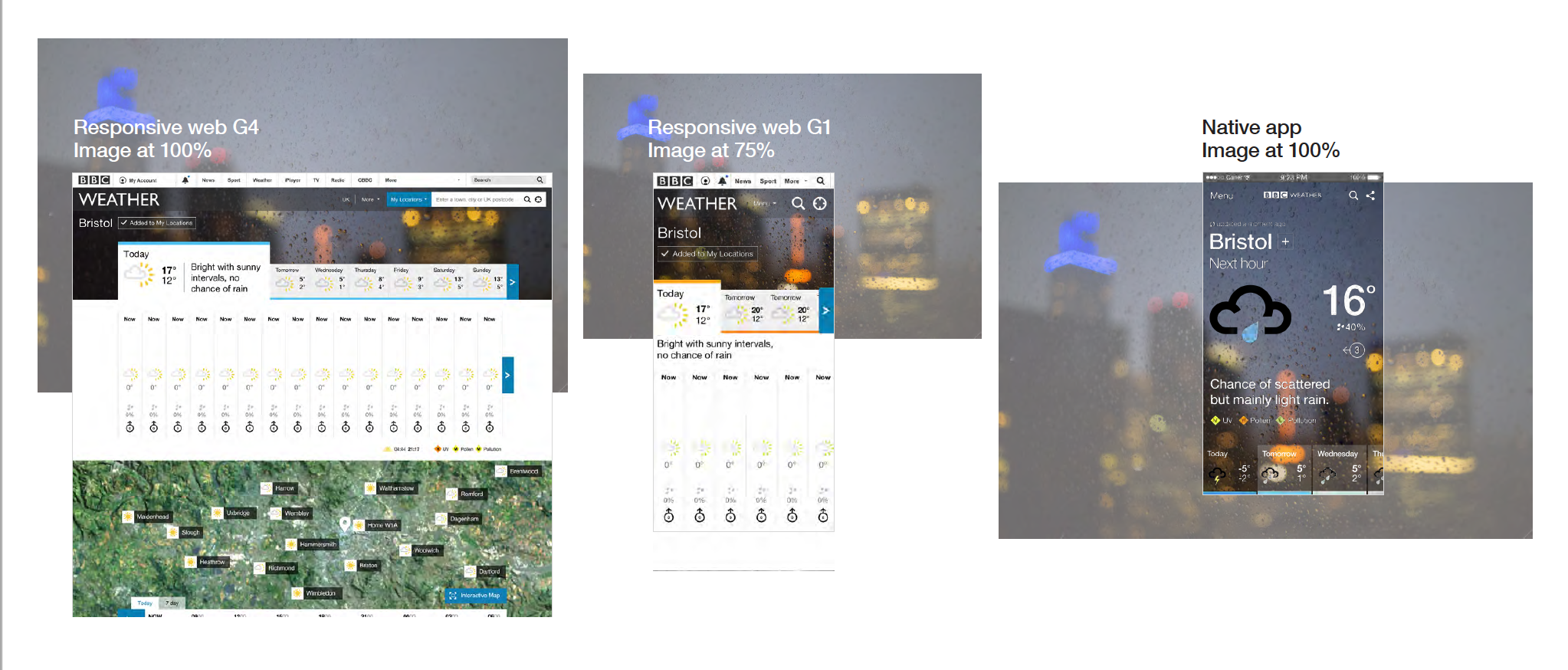
The redesign became the BBC’s first service-design initiative, bringing app, web, television, radio and editorial teams around a shared direction. Moving Brands developed “Window on the Weather”, inspired by the instinct to look outside before deciding what to do.
Broadcast had already set the direction
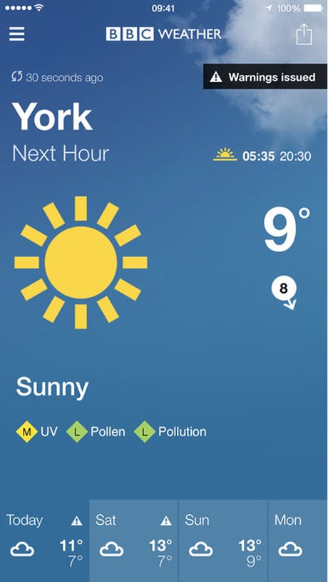
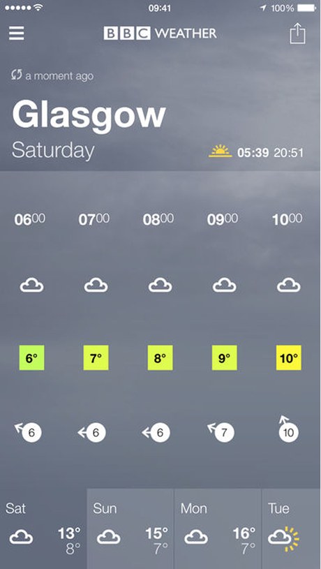
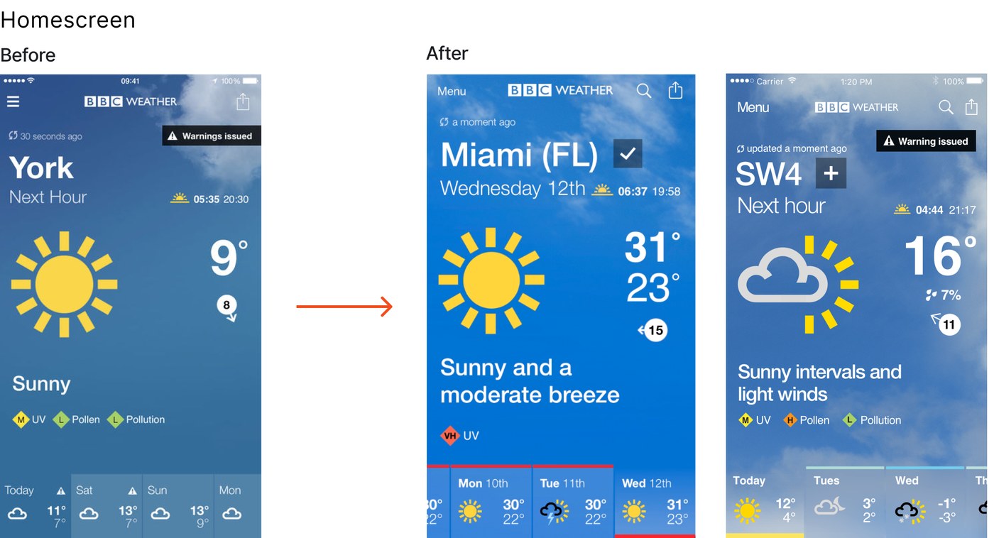
On television the weather was being told through real footage of real conditions. That was the standard the rest of the service had to meet, and at the time digital did not meet it: a flat blue gradient behind a symbol is not the same idea.
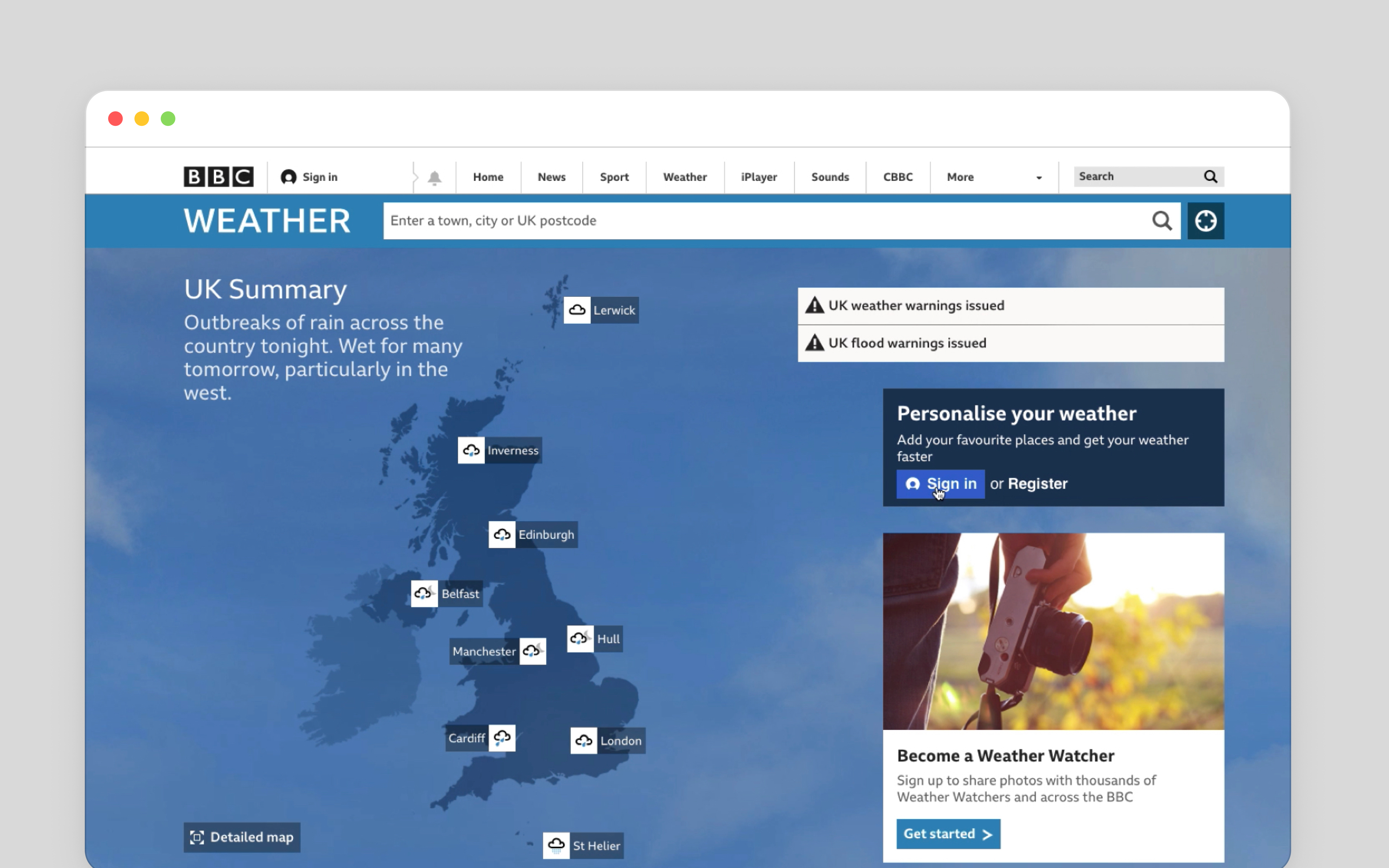
This is the part of the service-design approach that mattered most to me. Whichever way you came to the BBC for the weather, a phone on the way out of the door, the site at a desk, the forecast after the news, it should feel like one service rather than several teams' work that happened to share a name.
Consistency across devices and media was a constraint on the app, not an aspiration for it.
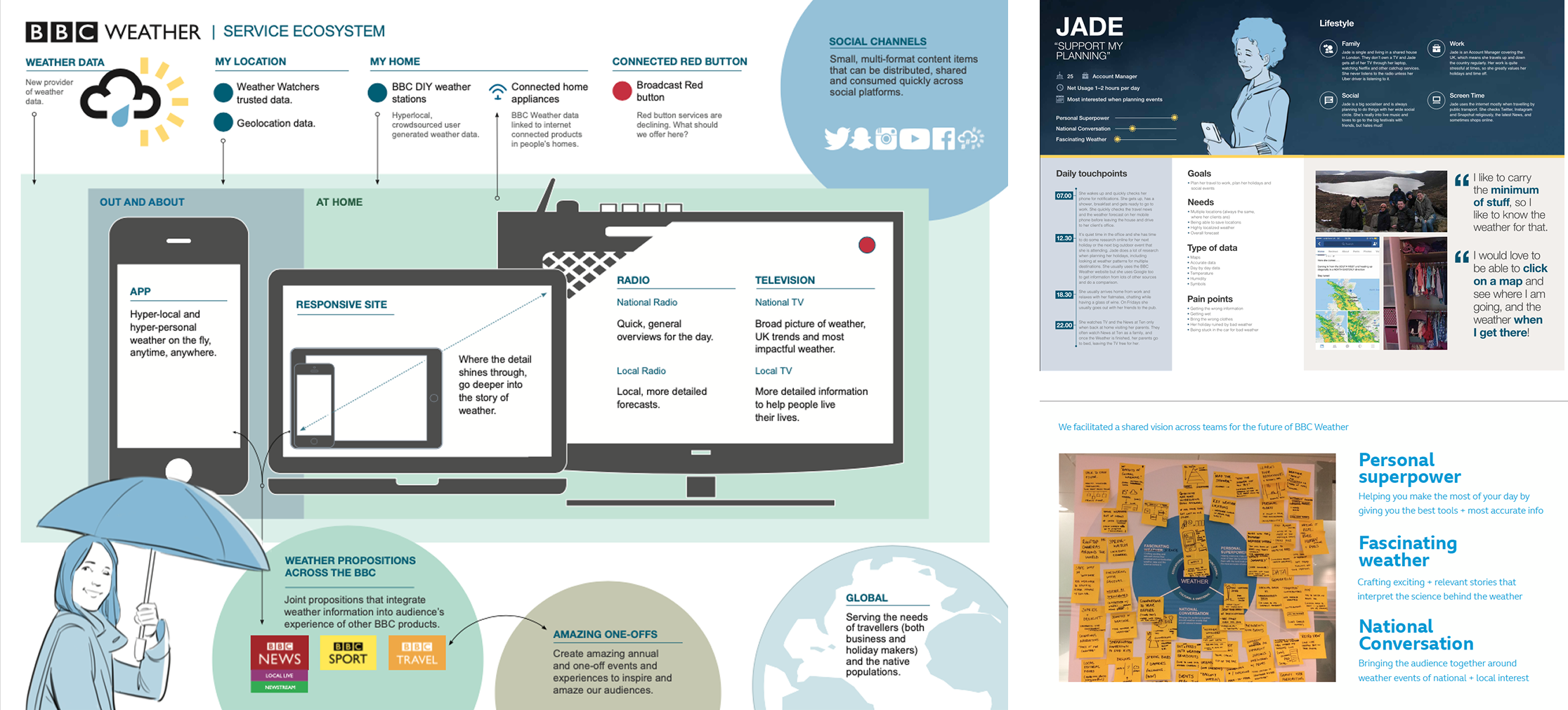
My responsibility was to translate that service vision into an app experience that worked at a glance and supported deeper planning when the stakes were higher.
Approach
One forecast, multiple ways to understand it
The more a plan mattered, the more detail people needed
Diary studies, interviews and usability research showed that people read the weather differently. Some preferred a written summary; others looked first at imagery, symbols or numbers.
The importance of the decision also changed their behaviour. An umbrella check might take seconds. A camping trip could prompt repeated checks over several days.
I organised the experience around three needs:
- Glance. Understand the immediate conditions.
- Plan. See what is coming and what might change.
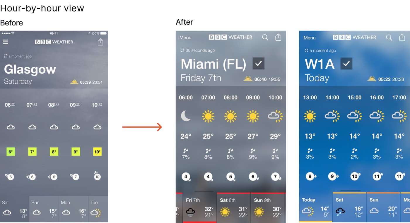
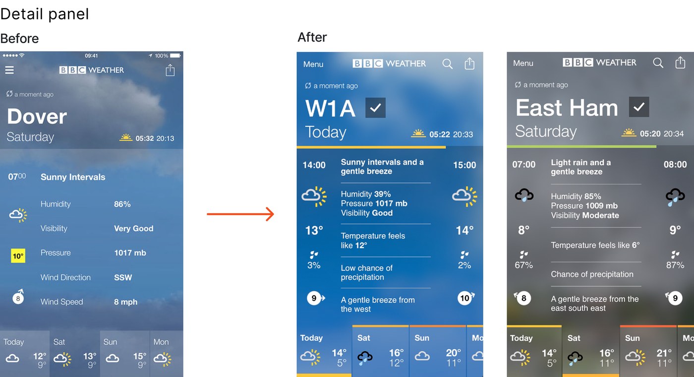
- Detail. Inspect the hourly forecast before deciding.
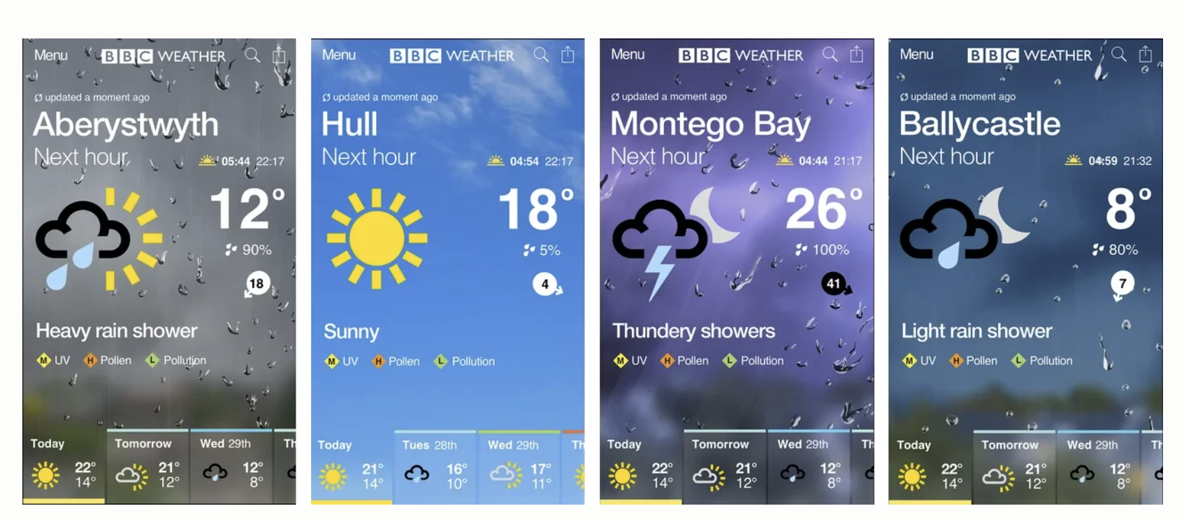
Atmospheric imagery, written summaries and forecast data worked together, allowing people to choose the depth they needed.
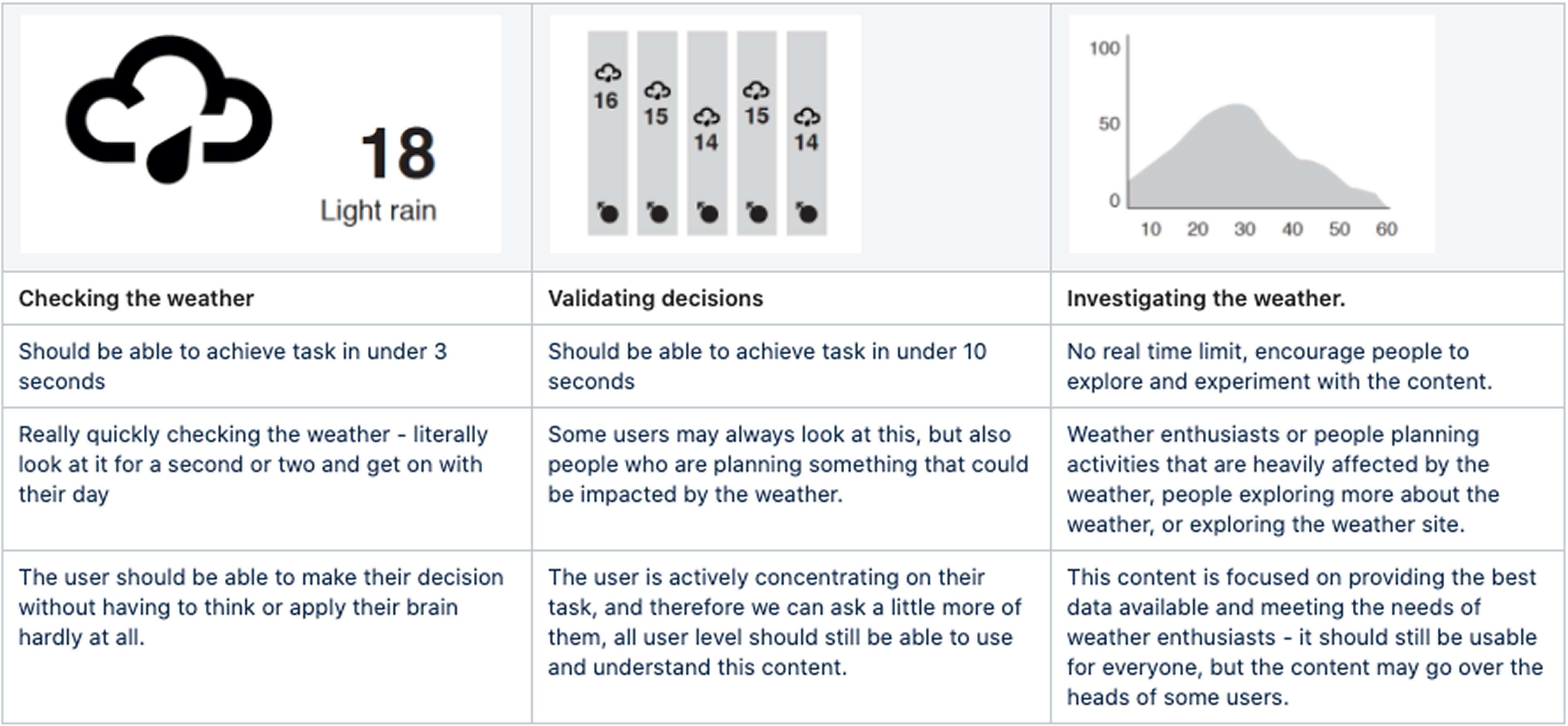
We wrote this up as a framework, Telling the Weather, so that content decisions could be argued against something rather than settled by preference. It put a time budget on each way of reading a forecast, and said how much effort it was fair to ask of someone in each.
We paired 14-day detail with weather education
People wanted to plan further ahead, but detailed long-range forecasts risked implying more certainty than the data could support.
We explored reducing detail later in the forecast. Testing showed that people preferred hour-by-hour visibility across all 14 days, provided they understood that forecasts could change.
Meteorologist walkthroughs, editorial content and blog pieces helped explain those limits. The app supported planning; the wider service supported understanding.
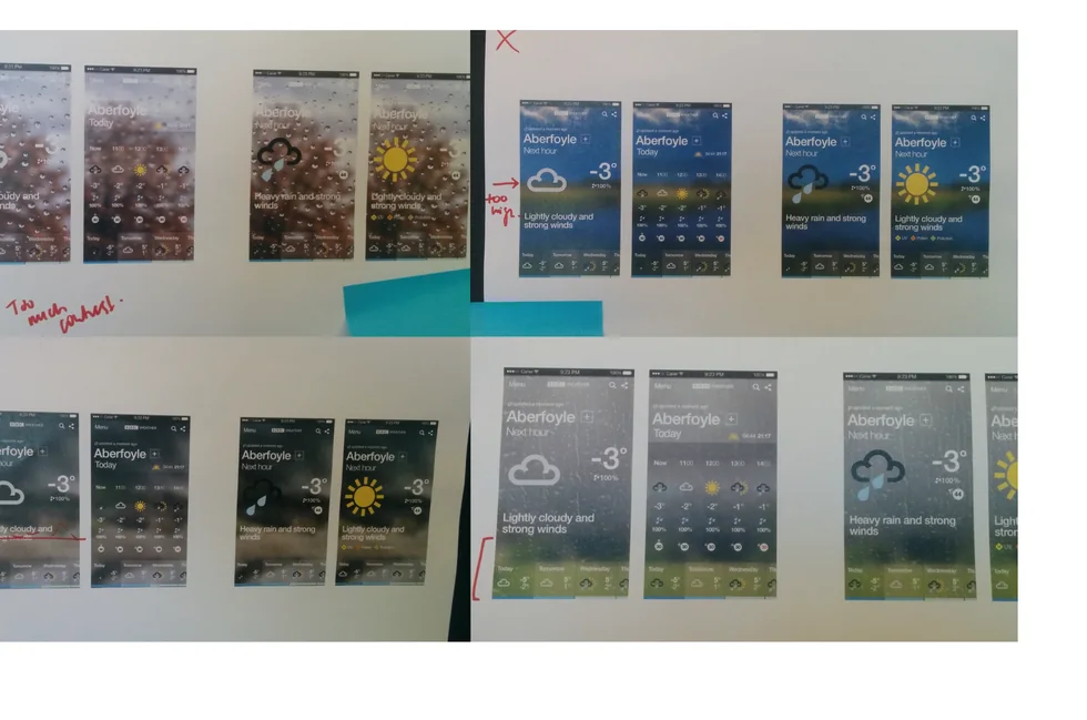
The background receded as the forecast came into focus
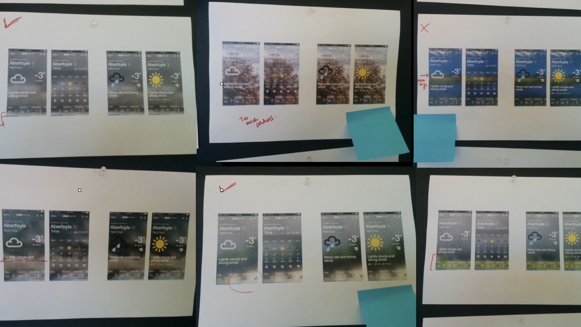
Atmospheric imagery made conditions immediately visible, but it could compete with detailed information.
I introduced clean text zones and consistent horizon rules, then tested difficult conditions such as snow. As people moved into the detail pages and hour-by-hour view, the background blurred and receded so the forecast stayed legible.
The blur was not a decorative effect. It was an accessibility rule: imagery could carry the condition at a glance, then fall back to a plain gradient when people needed to read numbers, timings and warnings.
Bringing the weather to life
Weather is a description of something in motion, and the old app rendered it perfectly still.
Symbols animate in place, rays turn, drops fall, lightning flickers, so the condition registers before a word of the screen has been read. The imagery behind them moves as well, so the rain on the glass belongs to the forecast rather than decorating it.
Motion also does structural work. Opening the hourly panel, moving between saved places, letting the background fall back as detail arrives, each transition shows where you came from and where you have arrived, instead of cutting between unrelated screens.
The animation and the imagery do the same job: making the condition legible before the numbers are.
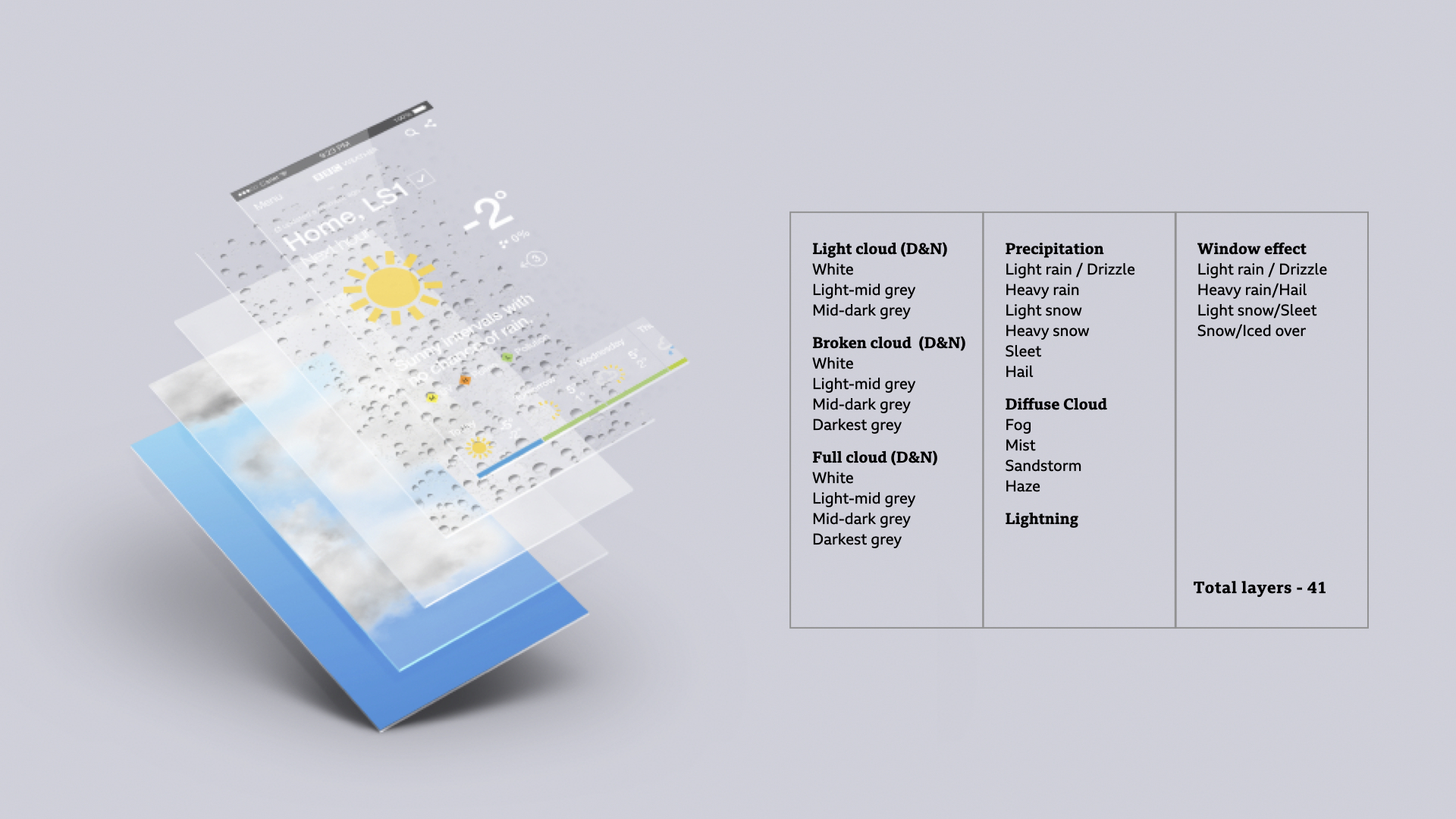
Explore the imagery system: Building the visual system behind BBC Weather How thirty-two weather states were built from forty-one reusable layers, on a £20,000 budget.
Results
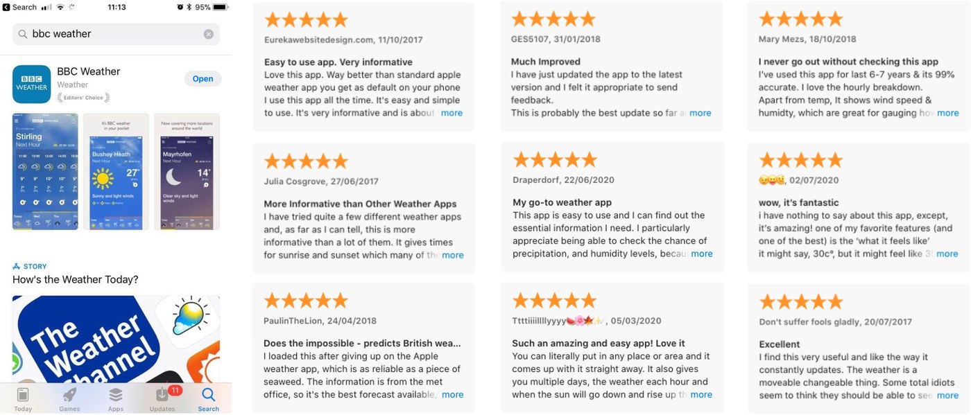
Growth in signed-in users and an approach adopted beyond Weather
Reflection
Two things stayed with me. First, scale can make the safe option feel responsible, but the work only moved once I stopped treating every change as irreversible.
Second, we delivered on time and on budget, but at a pace I would not ask a team to repeat. I count that as a cost of the project, not an achievement.
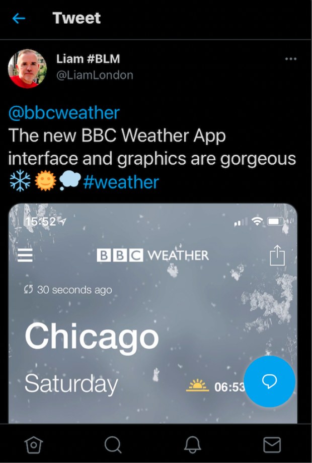
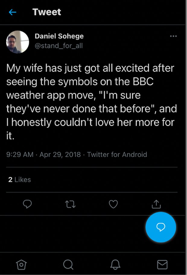
Unprompted audience response in the weeks after launch. The imagery and the animated symbols were what people noticed first, the detail underneath is what kept them signed in.
Explore the imagery system: Building the visual system behind BBC Weather How thirty-two weather states were built from forty-one reusable layers, on a £20,000 budget.