Context
An ambitious visual direction needed a practical production plan
The new brand direction, “Window on the Weather”, imagined the app as a view onto the conditions outside. My responsibility was to make that concept work across the app’s weather states.
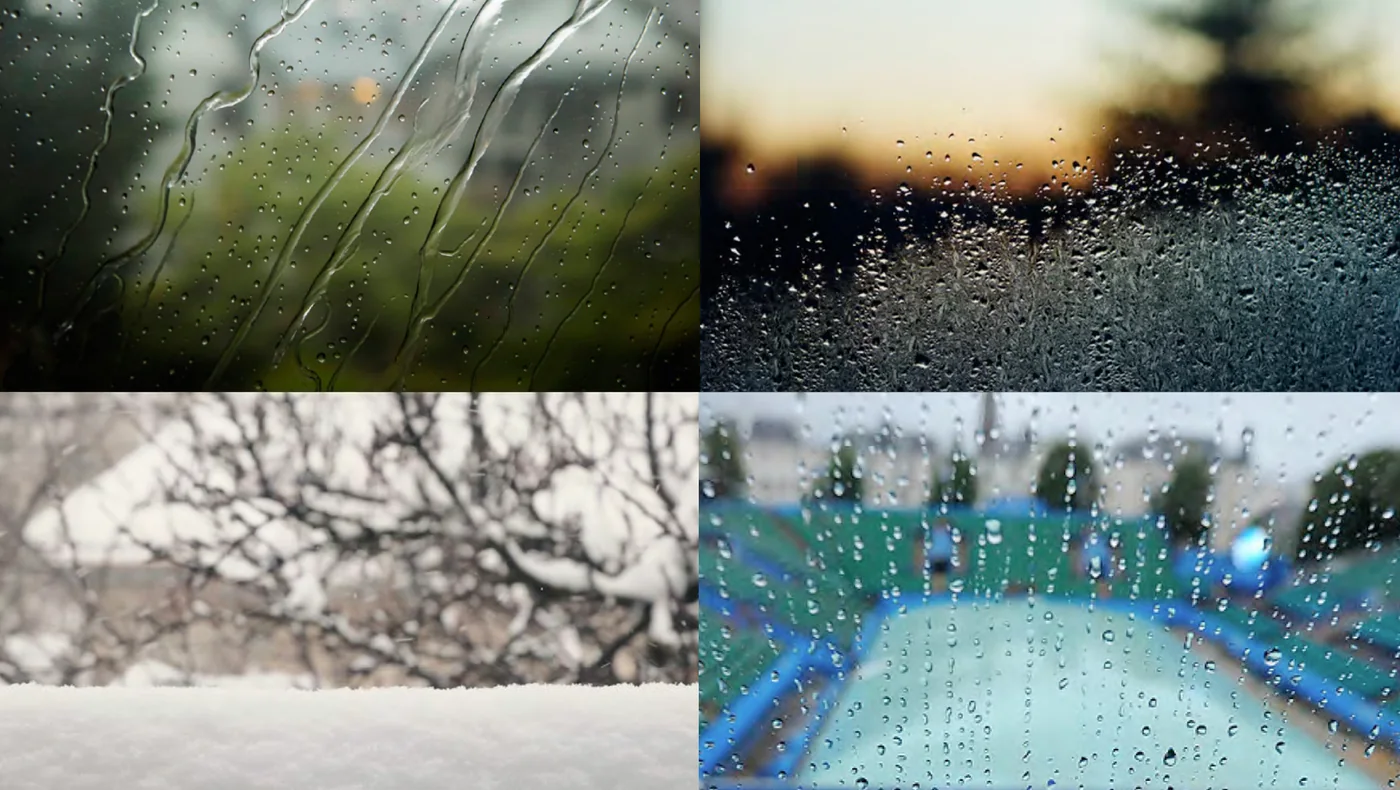
The imagery needed to feel natural, represent the forecast accurately and leave space for readable information.
Producing every scene separately would be costly and time-consuming. Stock photography offered limited control and ongoing licensing concerns, while matte painting risked losing the natural photographic quality we wanted.
I needed a way to create a consistent range without treating every weather state as a separate production.
Approach
A production system built around reusable layers
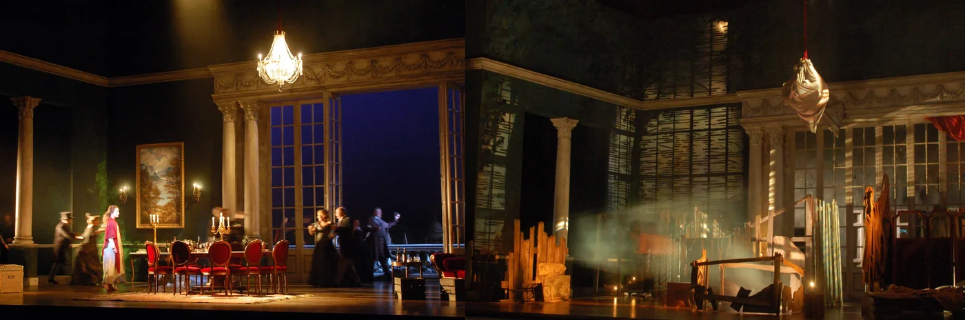
My scenic-painting background changed how we built the images
Scenic painting works in layers, and the same set of painted flats can read completely differently depending on how they're lit. Lighting a flat from behind or from above could produce a different effect from the same surface.
I applied that principle to the weather imagery. Skies, clouds and weather effects became layers, and changing how each was lit helped produce different conditions. This translated 32 required weather states into 41 reusable layers.
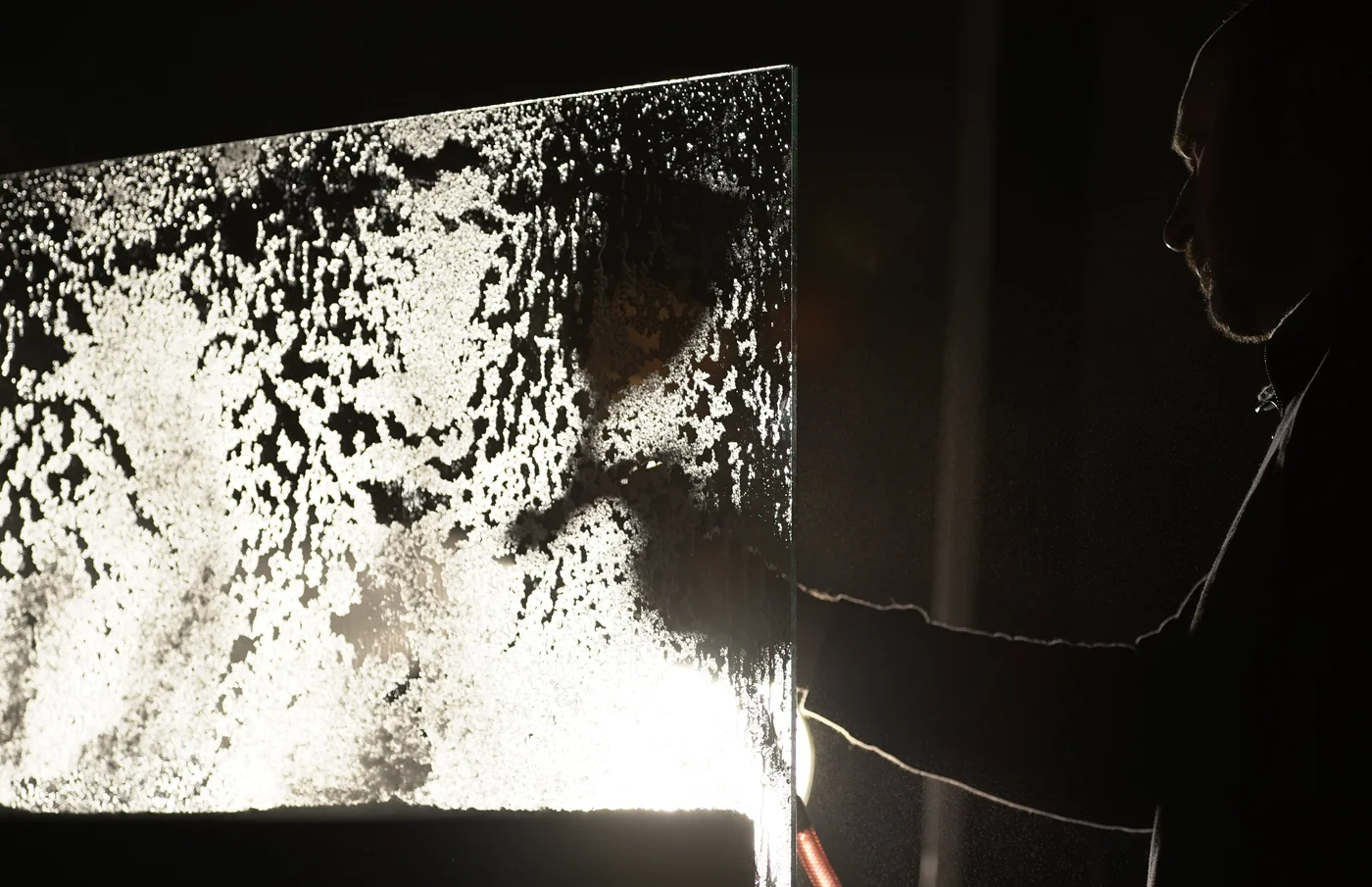
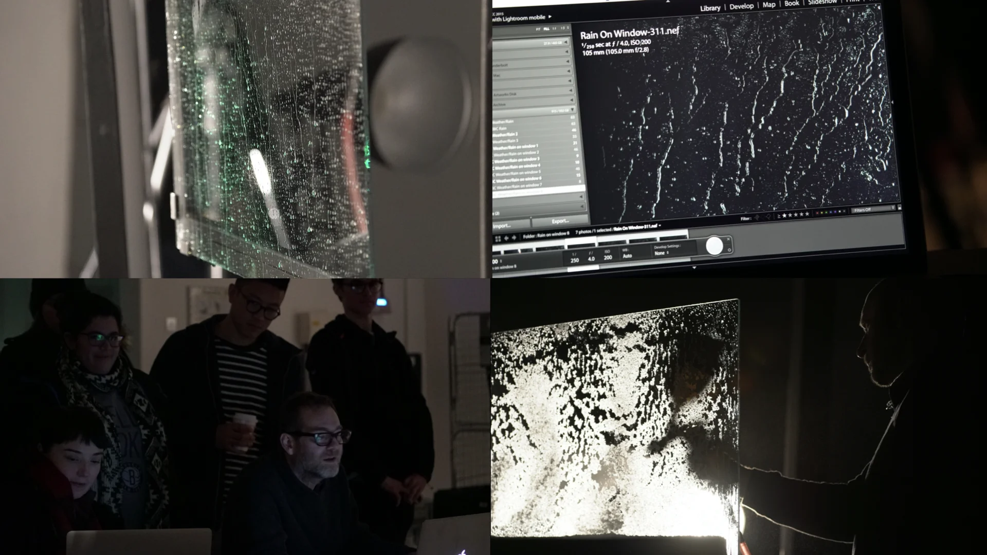
I commissioned a photographer to capture the backgrounds, with a separate studio shoot for window effects. The layered approach gave us control over the compositions and a reusable set of assets for future changes.
Meteorologists helped define the system before production
The combinations had to represent real weather.
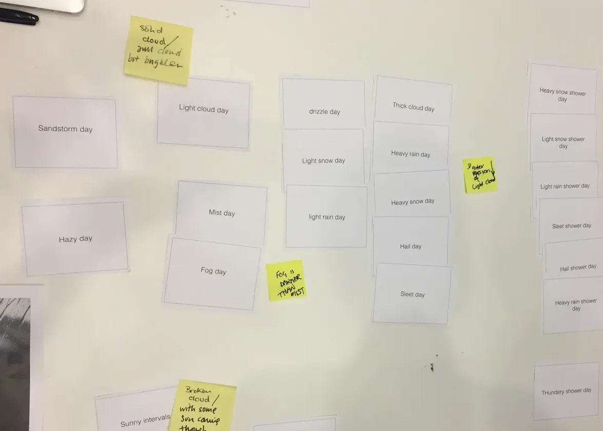
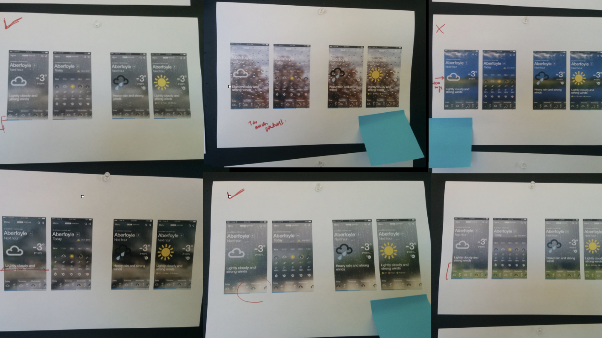
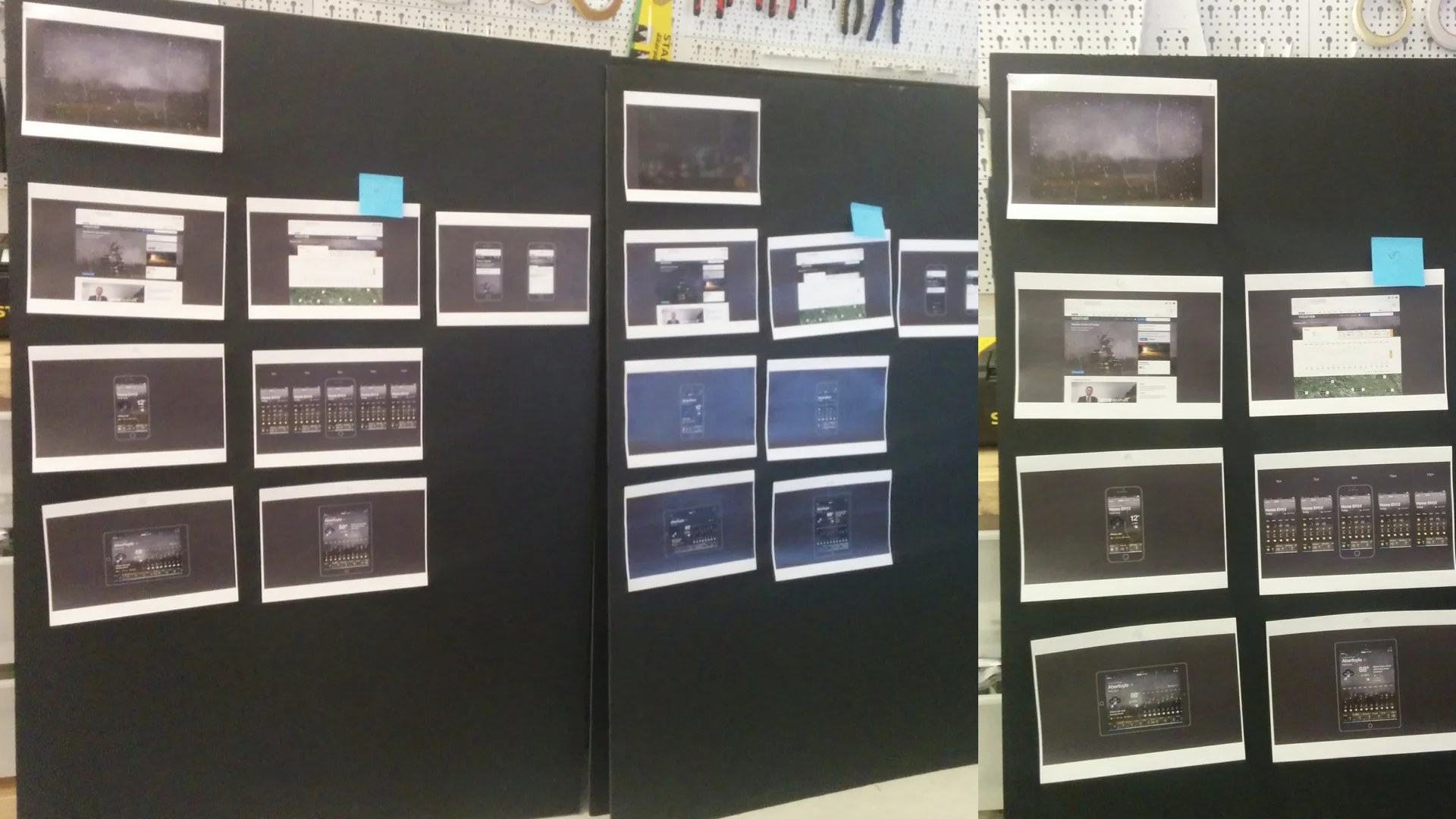
I worked with meteorologists to card-sort the weather states by cloud type, identifying which elements could be shared and which needed to remain distinct. Prototypes helped us assess whether the combinations were credible before committing to production.
Daily feedback and sign-off with Meteorology, Editorial and our creative partners kept the work aligned as it progressed.
Specialist knowledge shaped both the images and the way we produced them.
Every scene had to leave room for the forecast
The imagery needed to support the interface across changing conditions and levels of detail.
I established consistent horizon rules and clean text zones, checking difficult conditions such as snow. Alongside Engineering, I balanced visual quality with file size and app performance.
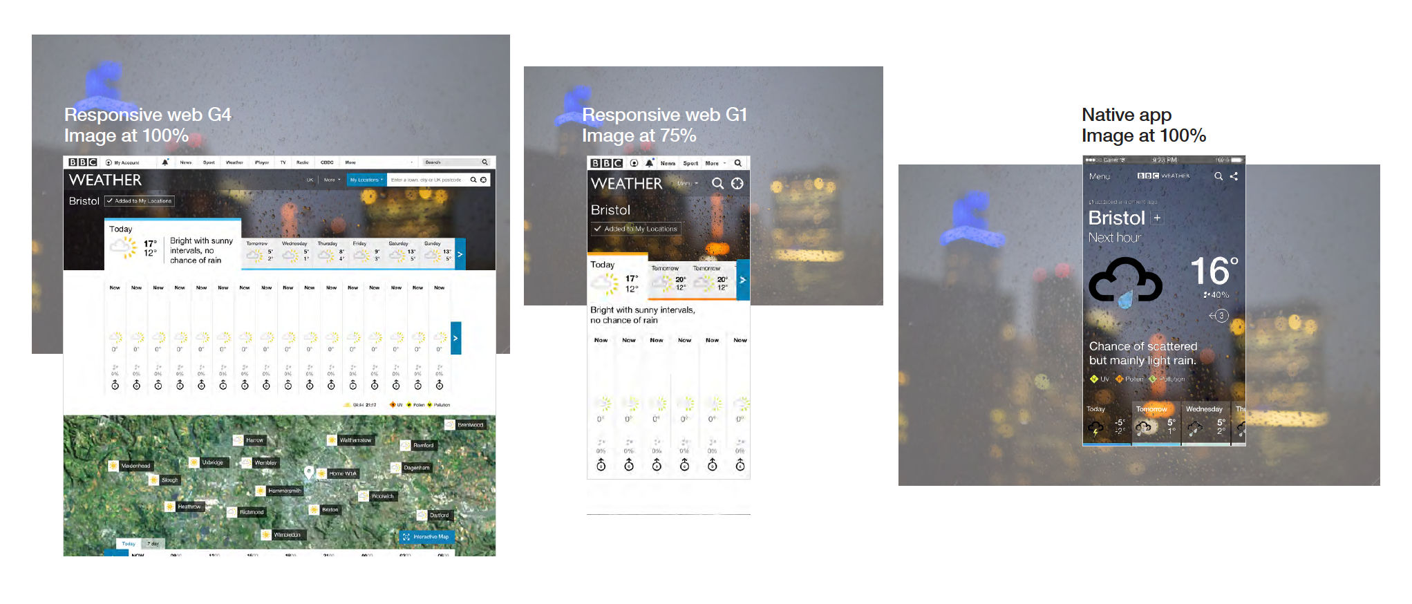
These constraints became part of the visual system, helping the assets work consistently inside the product. The companion redesign case study shows how the background also receded as users moved into detailed forecasts.
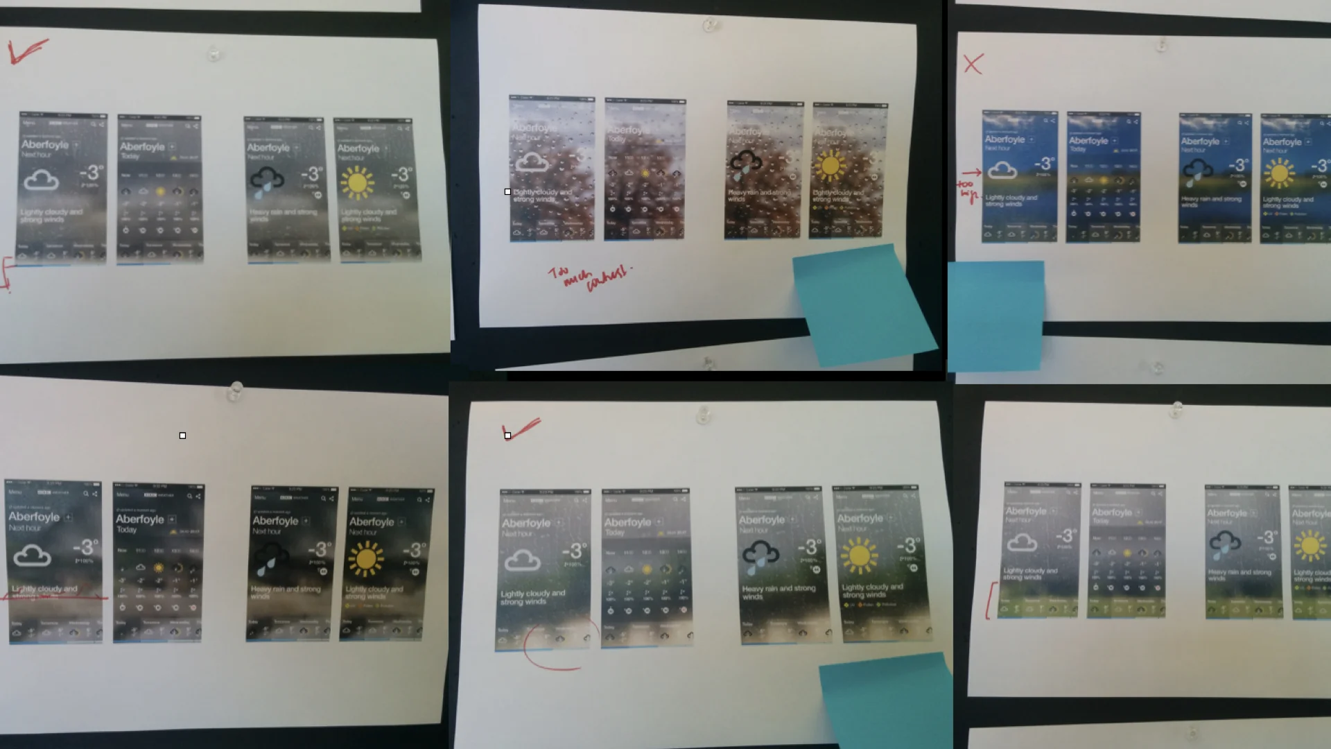
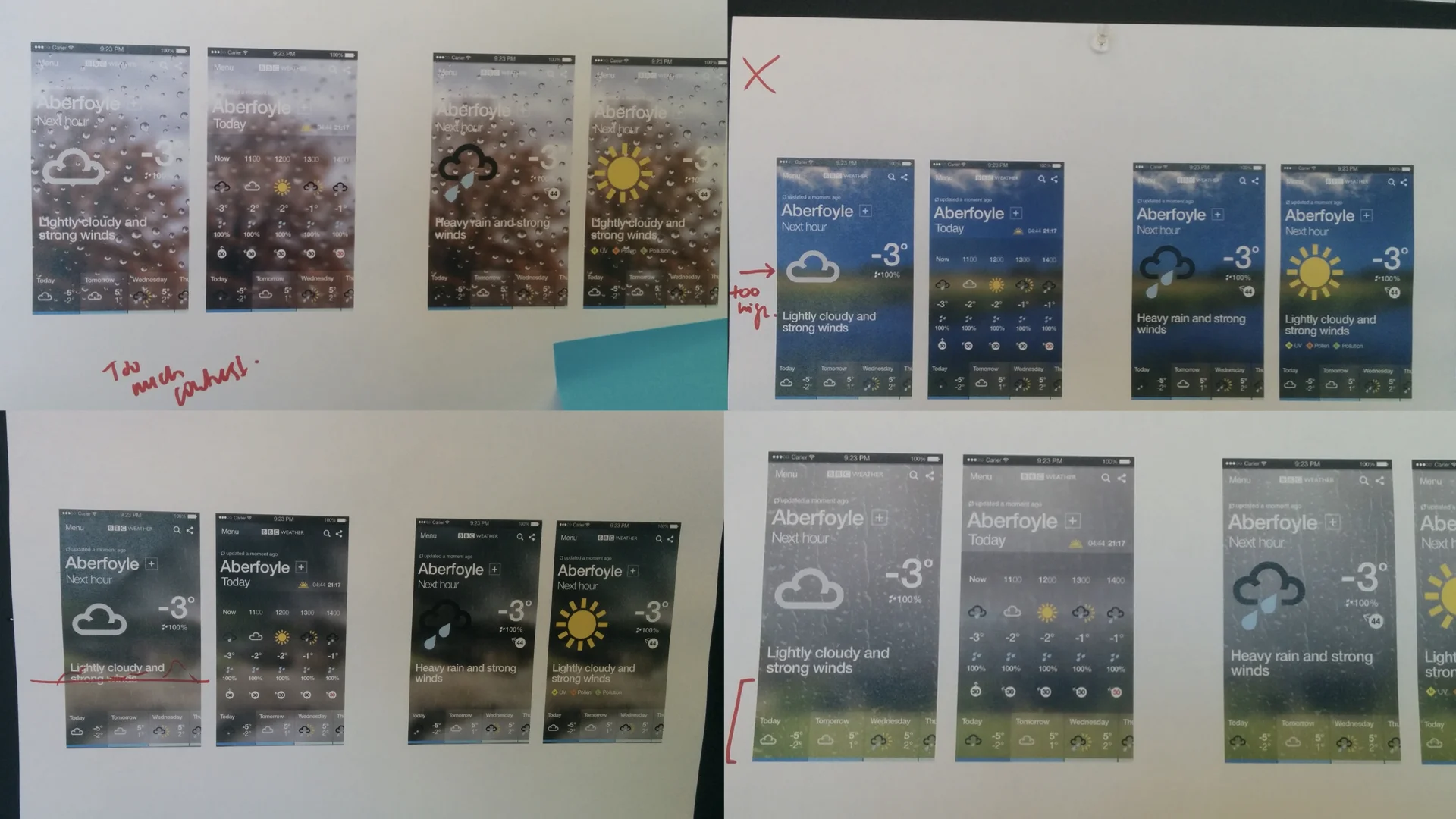
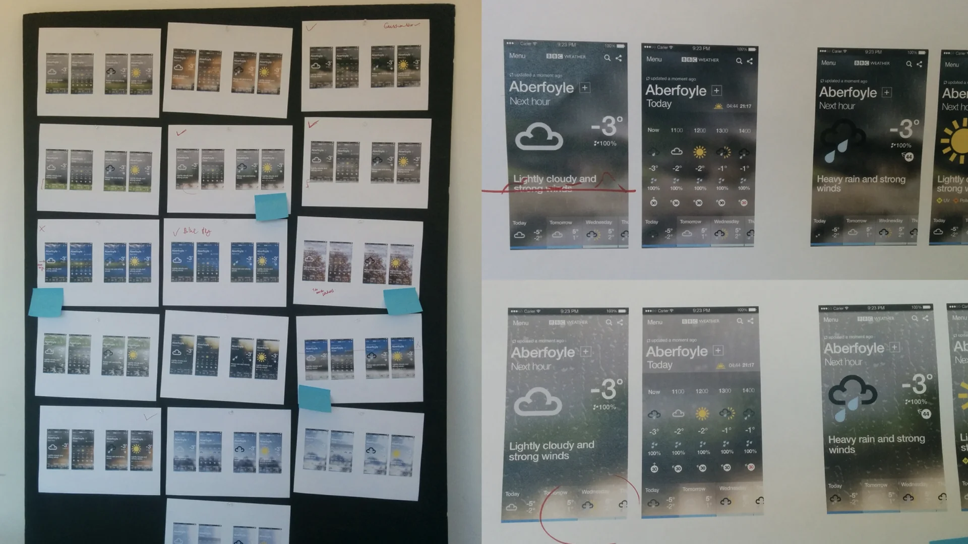
The background receded to keep the forecast legible
Atmospheric imagery made conditions clear at a glance, but it could compete with the numbers on detail pages and hour-by-hour views.
I used clean text zones, consistent horizon rules and a blur-to-gradient motion so the imagery carried the condition first, then fell back when people needed to read.
Results
A complete weather range from a reusable set of assets
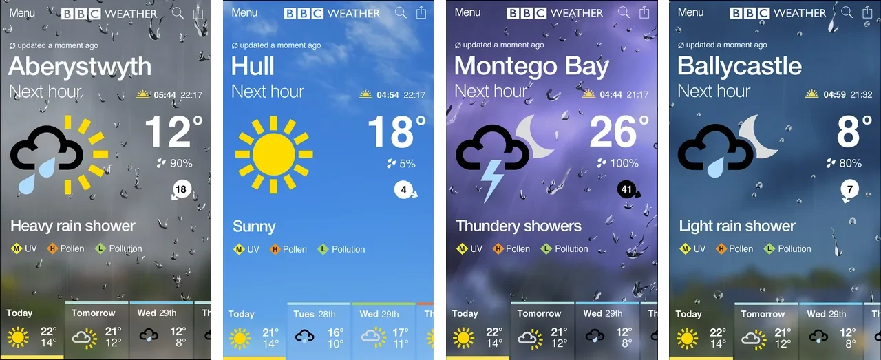
The system brought “Window on the Weather” into the app while giving the team reusable assets for maintaining and extending the imagery.
Reflection
The limits made the system better. With only six weeks and a tight budget, I could not treat every state as a separate picture. The discipline of reusable layers is why the library could keep growing after launch.
Explore the app redesign: Helping millions plan around the weather.